
August 19, 2026
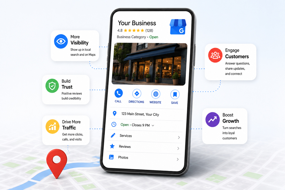
Ask most small business owners about their Google Business Profile and you will hear some version of the same thing: they set it up...


Establishing a compelling brand identity requires more than a logo and a catchy name. One of the most powerful — and often overlooked — elements in shaping a brand’s recognition and perception is colour. The right colour scheme can influence customer behaviour, evoke specific emotions, and build trust. Selecting brand colours isn’t simply a matter of personal taste; it’s a strategic decision backed by psychology, cultural relevance, industry standards, and visual design principles.
So how can businesses ensure they’re choosing the right colours to communicate their identity with clarity, confidence and long-term consistency?
Colour is a non-verbal communicator that can have an immediate and lasting impact. Research has shown that up to 90% of a consumer’s snap judgments about products are based on colour alone. Colour affects mood, shapes perception, and influences how a brand is recognised and remembered.
In branding, colours carry emotional energy. They can communicate strength, calmness, trustworthiness or excitement — often before a single word is read or spoken. Therefore, aligning your colour palette with your brand’s values, tone of voice, and target audience is essential.
Colour psychology explores how hues influence human emotions and decision-making. When used strategically, colour can trigger specific feelings that reinforce your brand’s core values.
Here’s a breakdown of popular colour associations:
| Colour | Emotion/Energy | Common Brand Use Examples |
| Red | Passion, urgency, excitement | Energy drinks, clearance sales |
| Blue | Trust, calm, professionalism | Financial institutions, tech companies |
| Green | Nature, wellness, growth | Health brands, sustainability businesses |
| Yellow | Optimism, happiness, clarity | Food chains, family-oriented services |
| Orange | Creativity, friendliness, fun | Entertainment, children’s products |
| Purple | Luxury, mystery, sophistication | Beauty and premium products |
| Black | Authority, elegance, power | Fashion and high-end electronics |
| White | Simplicity, purity, peace | Health and technology |
By aligning colour selection with brand personality traits such as sincerity, excitement, competence or sophistication, businesses can build deeper connections with consumers.
When selecting colours for a brand identity, multiple attributes must be considered to ensure the palette delivers consistency across platforms while resonating with your audience:
A well-designed palette uses principles from colour theory to maintain balance and coherence:
Each scheme has its advantages, but it’s important to test the combinations in different contexts to evaluate real-world performance.
Brand colours often align with industry-specific themes. Below is a general guide:
| Industry | Popular Colour Trends | Emotional/Strategic Appeal |
| Finance | Blue, Grey | Trust, security, professionalism |
| Healthcare | Blue, Green, White | Cleanliness, calm, wellbeing |
| Food & Beverage | Red, Yellow, Orange | Appetite stimulation, warmth, attention |
| Technology | Blue, Black, White | Innovation, reliability, simplicity |
| Beauty & Fashion | Black, Gold, Pink, Purple | Luxury, elegance, creativity |
| Sustainability | Green, Earth tones | Eco-consciousness, harmony, authenticity |
Selecting your brand colours should follow a clear process to ensure consistency and strategic alignment:
Once your palette is established, consistency in usage becomes vital. Inconsistent colours can dilute brand recognition and weaken consumer trust. Maintaining the same tones across your website, packaging, uniforms, signage and digital assets enhances recall and professionalism.
Additionally, colour consistency contributes to a seamless user experience in both physical and digital environments. It improves navigation, creates emotional connection, and increases confidence in your services or products.
If you’re building or refreshing your brand identity, understanding colour theory is only half the equation — implementing it with strategy and consistency is where the real impact lies. Generate Your Audience specialises in building memorable, visually engaging brand experiences that drive audience connection and business growth. From defining your brand personality to delivering consistent visual assets across all platforms, we help you stand out in an oversaturated market.
Whether you’re launching a new venture or repositioning an established business, our tailored branding services ensure your colour palette speaks volumes — subtly but powerfully — about who you are. Let Generate Your Audience help you convert colours into conversions and design into loyalty.
1. How many brand colours should I use?
Ideally, choose a primary colour, two to three secondary colours, and one or two accent colours. Keep the palette limited to maintain clarity and brand recognition.
2. Can I use different colours for different marketing campaigns?
Yes, but ensure they are derived from your core brand palette or used with consistency. Deviating too far from your base colours can dilute your visual identity.
3. Are certain colours more effective in digital formats?
Bright and high-contrast colours tend to perform better on screens, but testing your palette across devices is critical to ensure consistency.
4. Should cultural meanings of colours influence my brand?
Absolutely. Colours carry different symbolic meanings across cultures. Always consider your audience’s geographic and cultural context when finalising a palette.
5. How often should I update my brand colours?
Brand colours should not change frequently. Minor adjustments or modernisations may be needed every 7–10 years, but dramatic shifts can confuse loyal customers unless well-strategised.
6. Is black a safe colour for any brand?
Black conveys sophistication and elegance but may also feel cold or unapproachable if not paired correctly. It’s best used by brands aiming for a premium or minimalist feel.
Ask most small business owners about their Google Business Profile and you will hear some version of the same thing: they set it up...

A new acronym has entered the marketing vocabulary, and unlike most, it points to a genuine shift rather than a rebrand of something old....

Search has changed shape faster in the past two years than in the previous ten. Ask Google a question today and the first thing...